Interface basics
The handful of things that work the same on every screen — the navigation capsule, the shape of a list, the shape of a card, dialogs, and the three ways Hafrix tells you something. Learn them once and every section reads itself.
Where: everywhere. Nothing on this page belongs to one section; the sections themselves are described in their own pages, starting from the Contents.
Who can do what
| Role | Everywhere in Hafrix |
|---|---|
| Viewer | Open the lists and the cards of the sections granted to them, sort, filter, choose columns, and Export where the section offers it (Items, Compliance, Utilization, Finance) |
| Operator | + the checkboxes on list rows and the selection bar, the create and edit buttons on data screens |
| Manager | + Settings in the profile menu |
| Admin | + the admin-only half of Settings — people, invitations, groups and which sections they grant |
Two different things decide what you see, and they are not the same thing (details in Roles & access): your role says how deeply you may change data, your groups say which sections exist for you at all. A section your groups do not grant is not greyed out — it is simply absent from the capsule.
At a glance
Every list in Hafrix is built from the same parts, in the same order: quick views at the left of the toolbar, searching and filtering at the right, the actions above them, the table in one card, the count in the footer. This is Tickets; Items, Jobs, Maintenance, Invoices and Stock read the same way. The short reference lists take only the parts they need — see the note under the legend.
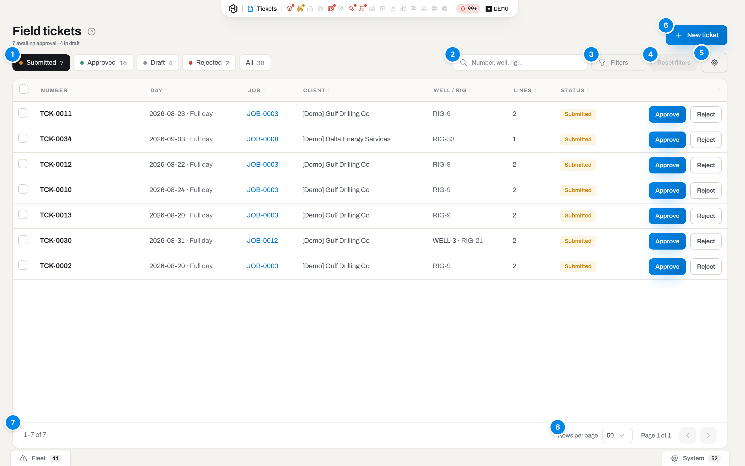
- Quick views — the questions this section is usually asked, each with a live count. One of them is always on, and the black one is where you are.
- Search — a free-text box whose placeholder tells you what it matches (here Number, well, rig…). It searches the whole section, not the page you can see.
- Filters — a panel of the narrower conditions that slides out from under the side of the list, out by default; a handle sits on the rail's own outer edge and clicking it tucks the panel back under the list, leaving nothing but the handle itself, a thin 22px strip with a single chevron — no icon, no count, in either state — and clicking it again slides the panel back out. The chevron points to where the panel will go: → while it is out, ← once it is tucked away. Below 1200px wide the strip is gone and the panel is an overlay instead, opened and closed by a Filters chip in the toolbar. The list narrows but stays in view and recounts itself as you pick, so a condition never hides its own result. A section with one or two filters has no panel at all — those sit in the toolbar as ready-made selects. Clearing a condition is not done here: a Reset all sits in the tray of active filters above the table, or in the rail's own header once it slides out as an overlay below 1200px (see the paragraph on the tray, further down).
- Columns — the gear: how this list looks to you. Tick the columns you want, switch the rest of the screen on or off, and put everything back with Reset to department view. Some columns cannot be hidden; some are hidden until you ask for them.
- Actions — what you can do to the section as a whole, always at the top right, outside the toolbar, each with its icon on the left. The main one — New ticket, New job, Receive — is a filled button of its own. The rest share one split button: the first of them is on the button itself, and the arrow next to it opens a menu with the others (arrow keys move through it, Esc closes it). A button you have no right to press is not shown at all, and neither is a menu item: when only one of them is left for you it is a plain button, with no arrow.
- The counter — 1–5 of 5: how much of the section your filters describe.
- The pager — Rows per page, the page number and the arrows.
Not every section carries all seven, and the missing ones are missing on purpose. Clients and Compliance have no filters at all — their toolbar is the search and the columns gear — while Kits, Stock and Purchase orders carry theirs as selects in the toolbar instead of a Filters panel, because one or two conditions are not worth a panel. Clients, Compliance and Stock end in a plain count (4 rows) with no Rows per page and no arrows: short reference lists come whole, so there is nothing to page through. Quick views differ too — Clients has none, Compliance offers Expired and Expiring as two independent switches, both on until you turn one off, and Items hides its readiness views on the Consumables tab, where readiness does not exist. Locations is not a table of records at all but two panes, the tree and what stands in it.
Two sections put more around the table. Items carries an Assets / Consumables switch and, further along the same table header, a three-way List / Tiles / Overview icon switch (rows, a grid of squares, or a board of widgets) — one section, three different ways to read it. Clients offers the plain List / Tiles switch, in its toolbar.
Every section with a Filters rail also shows the conditions you pick outside it: they sit as pills in a tray that rides out above the table itself, one pill per condition, in the order you set them. Each pill has a × to drop it; a field with a fixed list of values (a status, a kind, a priority) also opens a menu from the pill's text so you can change it without opening the rail, while a client, a job, a date or your search text shows as a plain pill. Reset all at the right of the tray clears every condition at once. The tray shows on a wide screen, next to the docked rail; on a narrow one the Filters button's count tells you how many conditions are set. The full walk-through is in Items, at a glance.
The capsule sits at the top of the frame in its resting state: the Hafrix mark, the section you are in, dim icons for the other sections, the bell, and your workspace logo — see Where notices appear for what the bell carries.
Key concepts
The capsule is the whole navigation
There is no header bar and no side rail. Everything that is not the screen itself lives in one pill pinned to the top edge of the window, and it has three states:
- Tucked — on a page that scrolls as a whole, scrolling down shrinks the capsule to a thin coloured line, and scrolling up brings it back. Section lists never do this: a list is exactly as tall as the window and scrolls inside its own card, so the capsule has nothing to react to and stays where it is. You meet the tucked state on the long pages — a card, most often.
- Resting — the brand mark, the section you are in, dim icons of the other sections, the bell with the unread count, and your workspace logo. A dim icon with a dot means something urgent is waiting in that section; hover it to read how much.
- Open — hover it with a mouse, or click it (or press Tab into it) on a touch screen or a keyboard. The urgent mark does not vanish when the capsule opens: a section link, or the group that holds it, carries the same dot on its icon, and inside a group's list every section with something urgent shows how many at the right end of its row. The section you are already in never carries the mark — it points at what you are not looking at.

Sections are grouped by the question they answer: Fleet — what we own and what state it is in; Operations — who it went out to and when. The four that answer on their own — Utilization, Finance, Clients, Connectors — stand alone. Settings is not in the row at all; it lives in the profile menu.
Esc closes the capsule. Clicking anywhere on the page closes it. Following a link closes it.
A card is a page, not a drawer
A click on a row highlights it; click its name, click the row again, or press Enter to open the full page under the capsule (Choose how a row click behaves) — never a sheet sliding over the list.
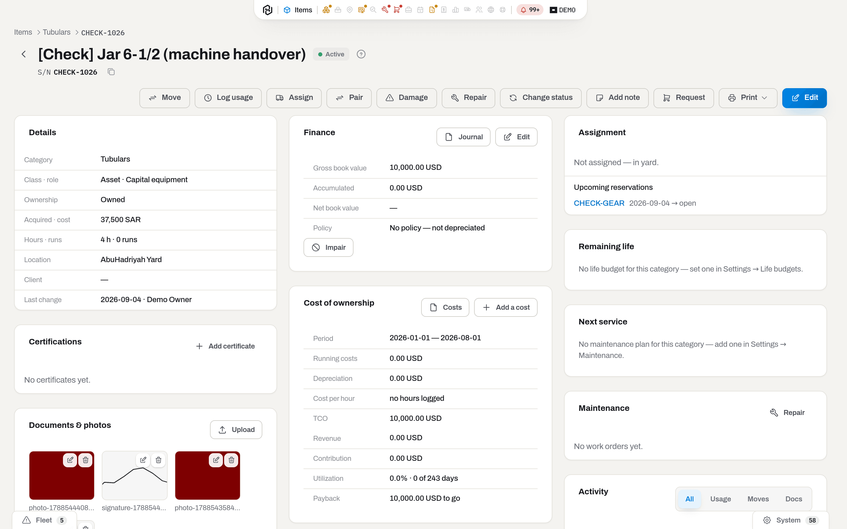
- Breadcrumbs at the top left say where this record sits. The section crumb always goes back to the section list.
- The back arrow before the name takes you where you came from — the list if you came from the list, the other card if you arrived from another card. It is not a "go to list" button: the breadcrumbs say where you are, the arrow retraces how you got here.
- The name carries the badges that matter: status, and any exception worth shouting about.
- The action bar to the right of the name holds everything you can do to this one record.
- Columns of cards below: what it is, what it costs, what is happening to it. Most records need two columns; the item card is the wide one and uses three. On a laptop the third column folds under the second.
- Switches inside a card change what one box shows, never the page. The timeline carries a segmented control — All, Usage, Moves, Docs; the fact sheet carries real tabs — Details and Attributes, the second one only where the category defines attributes.
Dialogs all follow one recipe
Anything that needs input before it happens opens a small window in the middle of the screen: a title, one line of hint explaining what the window will do, the fields, and a footer holding two buttons at the right — Cancel, and after it the one real button.
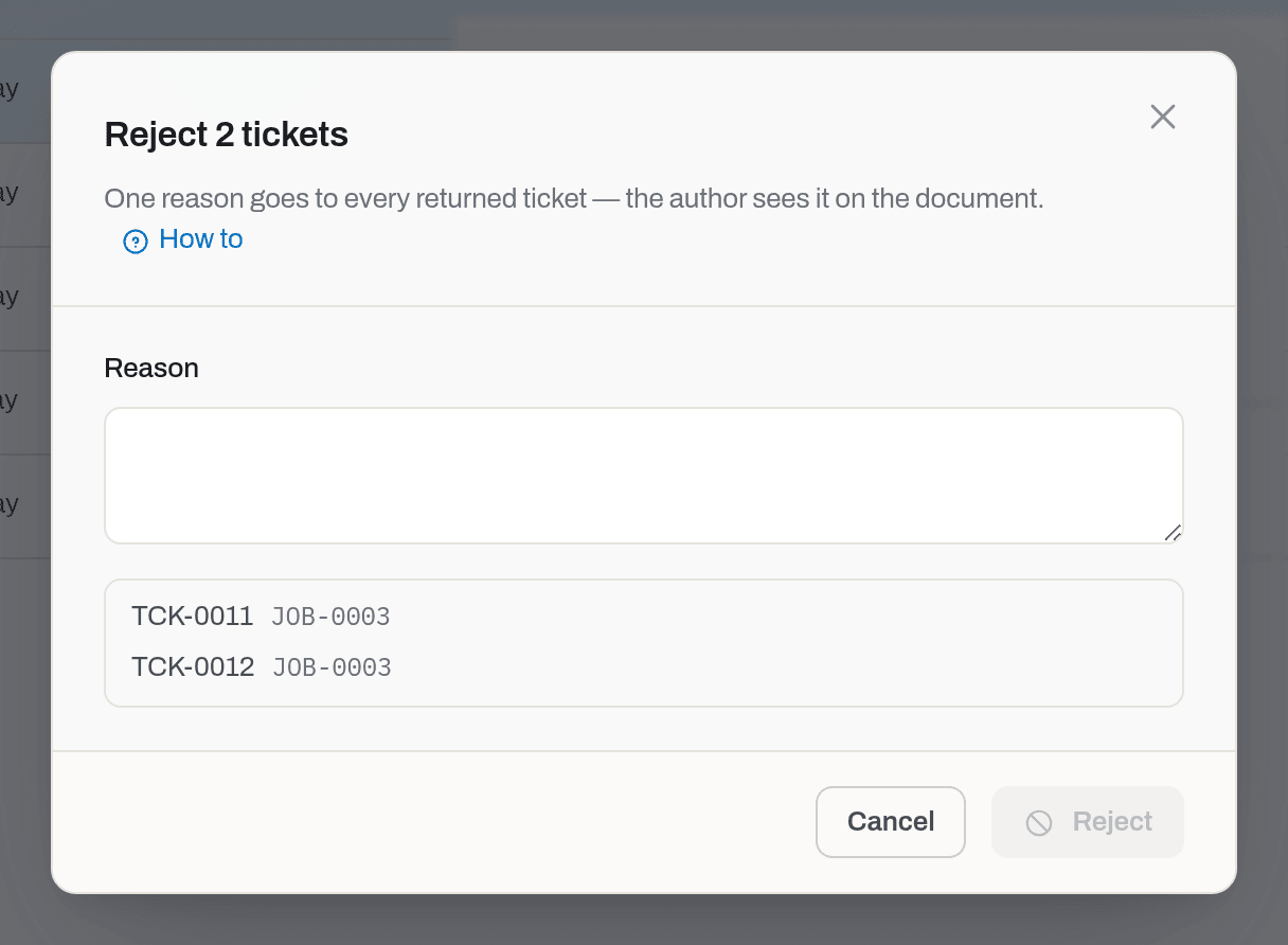
The main button stays disabled until the window has what it needs — an empty Reason here means Reject cannot be pressed. Esc, the ✕ and clicking the dim background all cancel; nothing is written until you press the button.
When there is nothing to fill in and the only question is "are you sure", the same window arrives as a confirmation: an icon, then either a sentence or the list of the records you picked, and the same two buttons.
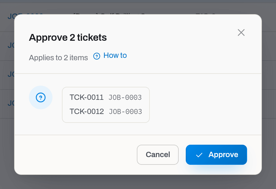
A confirmation about something destructive — deleting, voiding, cancelling — comes with a warning triangle and a red button instead.
Where notices appear, and why there are three places
Hafrix tells you things in three different ways, and the difference is not loudness — it is whose news it is.
| Layer | What it carries | How long it lives |
|---|---|---|
| Toast, bottom right | Your own action just now: Saved, Deleted, Done with the count of a bulk action that went through in part, Sent for an announcement, or the red Not saved with the reason | seconds; never recorded |
| The feed, behind the bell | Things that happened without you: a certificate expired, a ticket was submitted, an invoice went overdue | stays until you deal with it |
| The window in the middle | An announcement from your workspace or from Hafrix that must not be missed | until you press Got it |
The bell lives in the open capsule and carries the count of what you have not read. Its panel is one mixed list with three tabs — All, Fleet, System — plus Mark all read and a way through to All notifications.
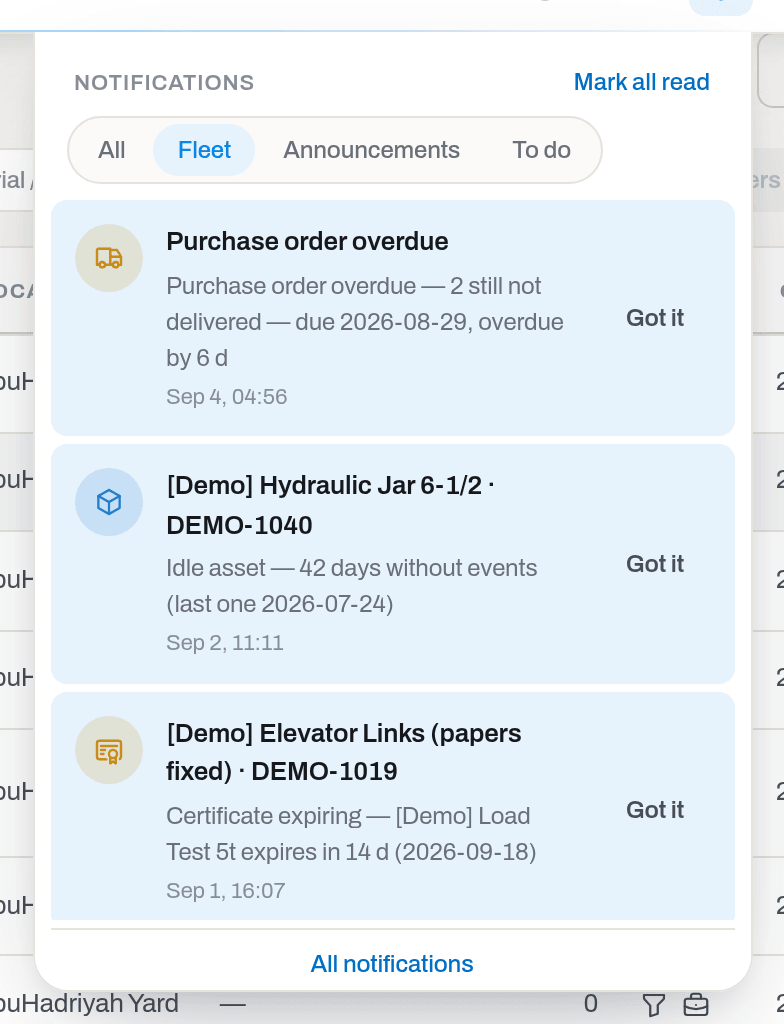
Fleet is everything that arrived as a fleet alert — papers, life budgets, an idle asset — plus a Time to reorder block above the list for stock that dropped below its minimum today, before tonight's rules run has even seen it. System is everything else the feed holds — an announcement, two-factor authentication, an unconfirmed address, a connector that did not answer. The tab is chosen by the kind of the row rather than by its subject, so whatever is not a fleet alert lands on System. The same tabs, with counts, are on the full /notifications page reached from All notifications.
Note
Notes about the data of one particular screen do not go into the feed. They appear as a strip under that screen's toolbar and belong to it alone.
How to
Find a section
Who: Viewer and above.
- Move the mouse to the top edge of the window — the capsule opens. On a touch screen, tap it.
- Fleet and Operations open a short menu; the rest are links.
- Click the section you want.
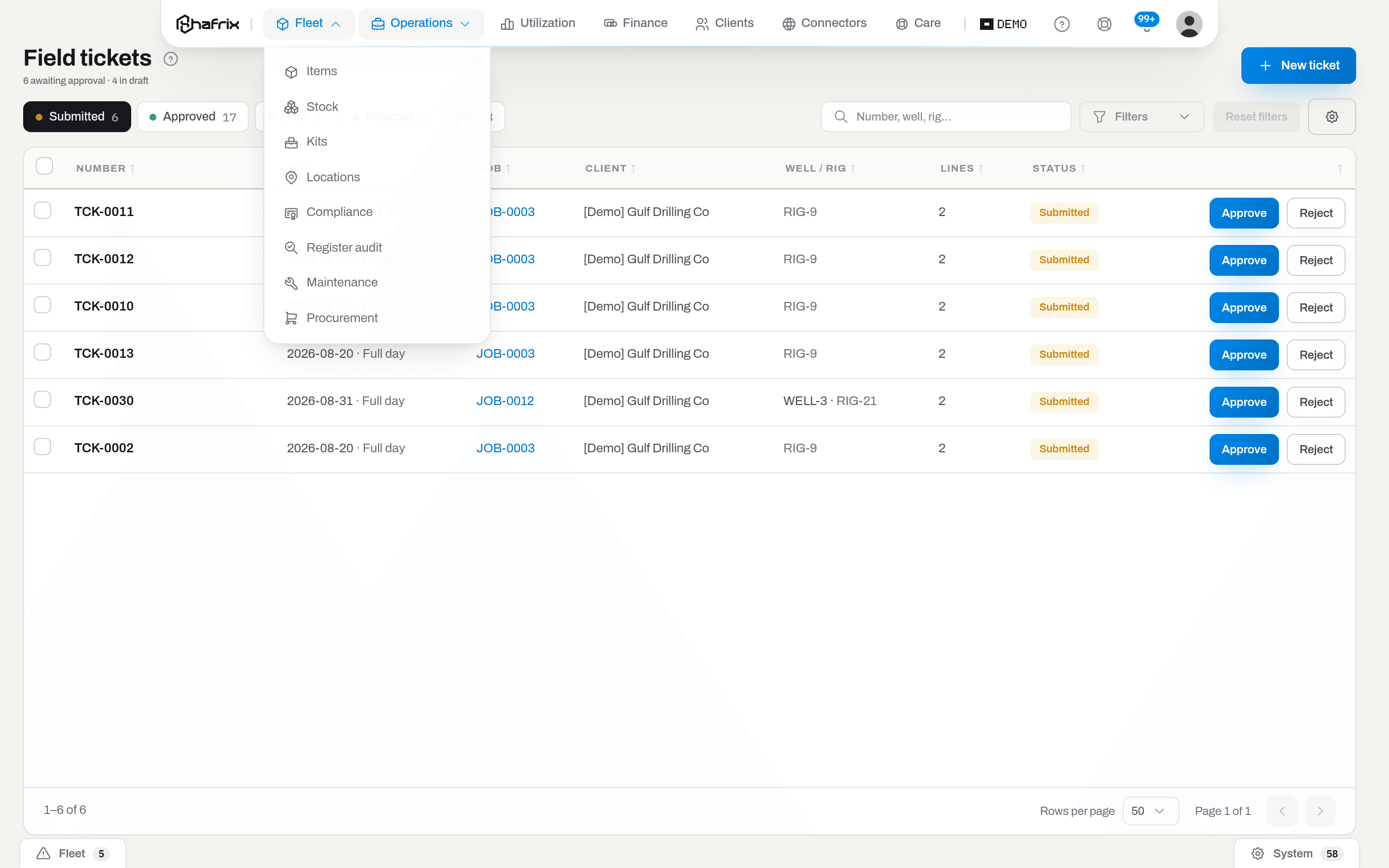
The shot is an admin's. Register audit is the one entry in the row that also asks for a role: the section is admin-only, and a manager who has been granted it still does not get the link.
Result: the section opens and the capsule folds back to resting, now naming the section you are in.
If it fails: the section is not in the list — your groups have not been granted it. Ask an admin; see Roles & access. A whole group disappears when none of its sections are yours.
Narrow a list down
Who: Viewer and above.
- Pick a quick view if one of them already asks your question.
- Type into the search box, and open Filters for the narrower conditions — or, in a section with one or two of them, pick them straight from the toolbar.
- Click a column header to sort by it: once ascending, twice descending, a third time back to no sorting. The list remembers the sorting you chose and opens with it next time, on any machine — unless you arrive by a link that names its own sorting, which always wins, so a link a colleague sends you shows what they saw.
- Reset all, in the tray of active filters above the table, puts everything back.
Result: the address bar carries what you chose (/items?readiness=NEED_INSPECTION&q=motor), so the view can be bookmarked, shared in a message, or reloaded without losing anything. The footer counts what is left.
If it fails: an empty table under a filter you forgot is the usual cause — the count bubble on Filters tells you how many conditions are still on. The line in the empty table is written by the section itself (No items match the filters in Items, No tickets here in Tickets) and it does not tell a filtered-out list from an empty section, so read the bubble and the search box first.
Set up how a list looks for you
Who: Viewer and above. This is how the screen looks, not what you may do, so even a viewer sets their own.
- Click Columns — its own button in the table's header on the newer lists, or the gear at the right of the toolbar on the rest.
- Under Columns, tick what you want to read and untick what you do not. Columns the section refuses to hide are greyed out, and on Items the characteristics of other kinds of equipment wait behind Show all fields — see Show a characteristic as a column.
- The rest of the screen — grouped as Toolbar, Filters, Bulk actions — sits behind its own gear next to Columns on the newer lists, or below the columns in the same panel on the rest. Tick one to bring it back, untick one to put it away. What your department's view already hides is here too, so anything an admin tidied away you can have back for yourself.
- Anything you cannot move is drawn greyed out rather than removed: your admin has locked it for your department. Hover it to see the Lock.
- Row density — its own two-icon switch next to Columns on the newer lists (hover an icon to see its name), or below the list of columns in the same panel on the rest — has two settings: Comfortable, the way every list opens, and Compact, which takes the padding out of every row so a list of hundreds of items fits nearly twice as many on one screen. It is kept per list, like the columns: Stock compact does not make Items compact.
- Reset to department view — behind its own gear next to Columns on the newer lists, or at the foot of the same panel on the rest — drops everything you changed here in one go: the widths and the order you set below, the sorting, the row density and Rows per page included; your saved views (see Save a view) are untouched, since resetting the screen is not the same as deleting a bookmark to it.
- To make a column wider or narrower, drag the divider at the right-hand edge of its heading; a double-click on that divider gives the column back the width it came with. The mouse is not the only way: click the column heading — or tab to it — and then the left and right arrow keys make the column narrower and wider a step at a time, Shift with an arrow key goes five steps at once, Alt with an arrow key carries the whole column to the left or to the right, and Home (or Delete) puts the width it came with back.
- To move a column, take its heading and drag it where you want it. Two of them stay put and refuse to be dragged — the name of the item and the number of a document — because those are what you click to open the card, and a list you cannot open leads nowhere.
- Export — where it sits differs by list. On the newer lists it is its own download-arrow icon button in the table's header, which opens a menu of Excel, CSV and PDF. On the rest, the same three sit as three rows next to Reset to department view, at the foot of the panel that is already open — no second menu to open. Either way it is the columns you left on, in your order, sorted the way the list is sorted right now, and all three formats carry the same readable content: headings as you see them, and a coded value (a status, a class, a custody word) spelled out the way the screen shows it — CSV here is not the raw-keys format, only a different container for the same text. PDF prints the table landscape on A4 with a title, your company and the date; past 3,000 rows it asks you to narrow the filters or use Excel instead. The first line of the CSV file is the column headings, and it opens in Excel as it is. This is the list on your screen, not the section's whole register — a few screens (Items, Finance, Compliance…) also offer their own Export on the whole filtered register, and there CSV is the exception: it keeps raw keys and codes for the import it feeds, while Excel and PDF spell them out (see e.g. Export the list).
Result: the screen redraws at once and the setting is kept with your account, not with the browser — it is still there after a reload, in another browser and on another machine, and nobody else's screen changes with it. Widths and order are kept the same way, and only for the columns you actually dragged: the rest keep following the product, so a column or a button that arrives in a later release appears for you too instead of being lost behind a setting you made months ago.
If it fails: Reset to department view goes back to what your admin set up for your department, not to the bare factory screen — if a column is still missing after a reset, that is your department's view, not yours (what an admin sets there). A checkbox that refuses to move is a locked one; a whole group missing from the panel means this list has nothing of that kind to switch. A column that will not budge when you drag it is one of the two that hold the list together, and a column dragged too narrow stops at the smallest width that still fits — double-click the divider to start again. The file from Export holds the rows of the page in front of you, not the whole section: put more Rows per page in the footer, or narrow the filters first, if you need them in one file. A column that draws a picture rather than text — a status light, a readiness bar — may come out empty in the file; names, numbers, quantities and dates are always there.
Save a view
Who: Viewer and above — a view is personal, like the columns it captures.
A view is a bookmark for a list, not a mode: it captures the filters and the tab you are on, the sort, the columns, the row density and Rows per page, all under one name. Click Views — the bookmark icon next to Columns — then Save current view… and type a name; saving under a name already in the list replaces that view rather than adding a second one. Click a saved view's name to apply it — the address and the list snap back to exactly that state — or click the bin icon beside a name to delete it for good.
Result: the Views button lights up while you are looking at a saved view — its name is in the button's hover tip and ticked in the panel — and it goes back to plain Views the moment you change a filter, since the screen is no longer that view. Reset to department view (see Set up how a list looks for you) never touches your saved views — it only resets the screen in front of you.
Work on many rows at once
Who: Operator and above. A viewer has no checkboxes at all — every action behind them writes.
- Tick the rows. A bar appears at the bottom of the screen with {count} selected.
- If you want everything your filters found rather than the page in front of you, click Select all {count} matching. One action takes at most 500 rows, so above that the link is not offered at all: the bar says Up to 500 rows at a time — narrow the filter, and the link comes back as soon as your filters bring the count under the ceiling.
- Choose the action from the bar. In Items the bar is grouped the way the item card is: Set names the fact you change, Add a record names the record you add, Print holds the printouts.
Result: the whole selection goes to the server in one request, and the server takes the rows one by one — so a partial result is normal. The toast reports it: Done — {done} done, {failed} failed, or the red Not saved — Nothing done — {count} rows failed — when none of them went through. The rows that failed stay ticked, and the list inside the window carries the server's reason beside each of them, so you can fix and repeat.
If it fails: a row that is greyed out before you send anything cannot take that action — the reason is written on it.
Open a card and get back to your place
Who: Viewer and above.
- Click a row to highlight it; click its name, click the row again, or press Enter to open it (Choose how a row click behaves).
- Read, or act, on the card.
- Leave it with the ← arrow before the name.
Result: you land back on the list you left — same filters, same page, and the very row you opened is scrolled under your eye, focused and marked. Long lists do not have to be walked twice.
If it fails: you arrived on the card by a direct link, so there is nowhere to go back to — the arrow falls back to the section list.
Switch to another workspace
Who: anyone who belongs to more than one workspace.
- Open the capsule and click your avatar at the right end.
- Click Workspace — the row unfolds into the list of workspaces you belong to, with your role in each.
- Pick one.
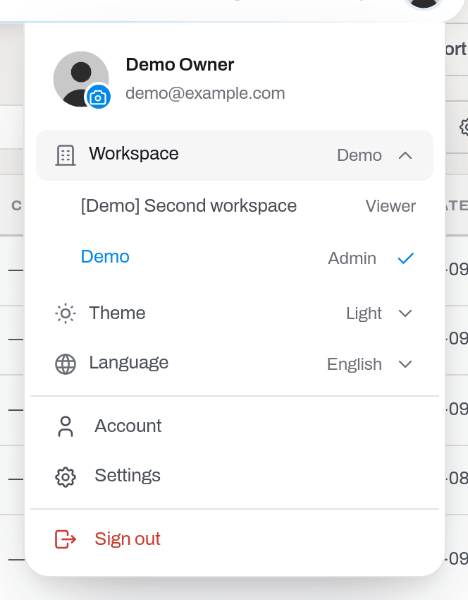
Result: everything reloads as that workspace — its equipment, its clients, its people. Your role can be different there, so buttons may come and go.
If it fails: there is a single Workspace line with no arrow — you belong to one workspace, and it is a fact, not a setting. Being invited to another is described in Getting started.
Change the theme
Who: Viewer and above.
- Open the profile menu and click Theme.
- Choose Light or Dark.
Result: the whole application repaints at once. Until you choose, Hafrix follows whatever your operating system asks for. The choice lives in this browser — your phone and your colleague's screen are unaffected.
Note
Hafrix speaks English. There is no language setting: the interface, this manual and every email are in English. What people typed — item names, client names, notes, categories — appears exactly as it was entered, and so do the industry terms that are never translated (BHA, S/N, Aramco); see the Glossary.
Open the manual from where you are
Who: Viewer and above.
- Press ? anywhere outside a text field — or click the ? in the open capsule.
- The panel opens beside the screen you were on, already showing this screen's page — the same one its own ? opens.
- Type in Search the manual to jump elsewhere.
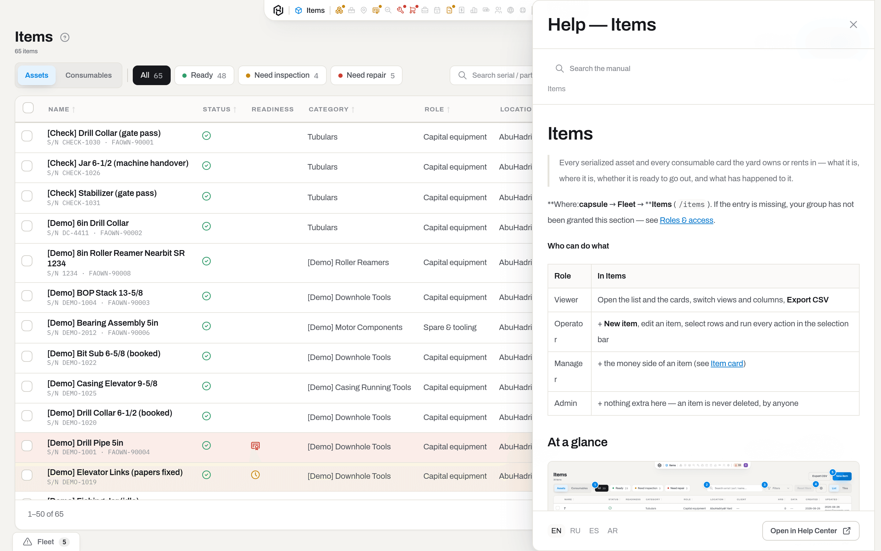
Result: the panel is not a modal — the application under it stays live, so you can read a step and do it. Esc closes it.
If it fails: No page for this screen yet — the manual is being written section by section. Use the search, or Open in Help Center for the full site.
Tip
Screens whose page is written also carry a small ? beside the page title, and their dialogs a How to link — both open the panel at exactly the task you are looking at, not at the top of the page.
What the system tells you
| What happened | What you see | Where |
|---|---|---|
| You saved or created something | toast Saved | bottom right, about 3 s |
| You deleted something | toast Deleted | bottom right, about 3 s |
| The server refused | red toast Not saved and the reason | bottom right, about 7 s |
| A bulk action went through in part | toast Done — {done} done, {failed} failed; the reasons stay in the window | bottom right |
| You sent an announcement | toast Sent | bottom right |
| Something happened without you | a row in the feed; the bell count grows | bell, All notifications |
| The fleet, you or the workspace need attention | the count on the Fleet or System tab | bell |
| An important announcement | a window in the middle of the screen | until Got it |
| Hafrix is being updated while you work | a window Sorry, Hafrix is updating — what you typed stays on the page | closes by itself, usually in under a minute |
| A list could not be loaded | a red note Couldn't load this list. with the reason and Try again in place of the list — it does not mean the records are gone | that list, until Try again loads it |
| Something about the data on this screen | a strip under the toolbar | that screen only |
Alerts about the fleet are recalculated once a night, so a certificate you fix today stops being counted tomorrow morning — see Alerts & notifications.
Related
- Getting started — the first sign-in, the password, the second factor.
- Roles & access — why a button, or a whole section, is missing.
- Admin guide — departments, and the view an admin sets for one.
- Items — the section where most of these patterns are worked hardest.
- Item card — the wide, three-column card in full.
- Alerts & notifications — what fills the feed, and how to change it.
- Account — your profile, your sessions, your second factor.
- Glossary — the terms this manual does not re-explain.
FAQ
A section my colleague uses is not in my capsule. — Sections are granted to groups. Yours does not have it, and Hafrix hides rather than greys out: a link that always refuses is worse than no link. Ask an admin to put you in the right group.
I can see the screen but not the button. — The button is drawn only where the server would accept the action. Reading and writing are separate rights: a viewer sees every list and card of a granted section and no checkboxes anywhere.
The capsule shrank to a line. — You are on a page that scrolls as a whole — a card, usually — and scrolling down tucks it away. Scroll up and it comes back; the pointer at the very top edge opens it wherever you are. On section lists it never tucks, because the list scrolls inside itself and the page does not move.
I marked everything read and the strips at the bottom still show numbers. — The bell counts what you have not read; the strips count what is still true. An expired certificate does not stop being expired because you looked at it.
A window says "Sorry, Hafrix is updating" and has no close button. — A new version of Hafrix is going live. Keep the page open: the window checks every few seconds, closes by itself when Hafrix is back — usually in under a minute — and sends again whatever you were loading or saving. A few changes cannot be sent twice safely; for those you get a red toast may not have been saved after the window closes — open the record and check. If the window says Taking longer than usual, keep waiting; if it lasts, write to Hafrix support at care@hafrix.com — a status page will come later.
I reloaded the page during an update. Am I signed out? — No. A reload while Hafrix is updating shows the same Sorry, Hafrix is updating window instead of the sign-in page. Wait for it to close and the page opens where you were. Hafrix sends you to sign in only when your session has really ended.
Does changing my theme change it for everybody? — No. The theme is stored in the browser you are using, not on the record.
Why do the columns look different on my colleague's screen? — What the gear sets is personal and per list: your columns, and the toolbar, filters and bulk actions you kept. It is stored with your account, so it follows you to any browser and any machine, and it reaches nobody else. Rows per page, the sorting and the row density are personal too and kept per list: pick 100 rows on Items and Jobs keeps its own. A list where you never chose a size follows the last size you picked anywhere in this browser.
A checkbox in the Columns panel is greyed out and will not move. — Two different reasons, and the panel shows both rather than hiding them. A column the section always needs (the one that opens the card, usually) is greyed out for everybody. Everything else greyed out was locked by your admin for your department — hover it to see the Lock, and see Set a view for a department.
I pressed Reset to department view and the screen is still not what I expected. — It resets to your department's view, which is the point: an admin may have tidied that screen for everyone in the department, and reset puts you back to their version, not to the untouched product. Switch to All departments to see the full screen.
I pressed Cancel — did anything happen? — No. Dialogs write only when the main button is pressed — the last one in the footer, the one that carries the icon. Esc, the ✕ and a click on the dim background are all the same as Cancel.
Updated 2026-09-29
New to Hafrix?
See this workflow in your operation
Explore the platform behind these guides: equipment inventory, rentals, maintenance and operational finance. Tell us which workflow you want to see.